Client Success Stories
 dataRecode help clients in both the private and the public sectors, improve their operations and achieve their goals. We have a proven track record of success, and our case studies demonstrate our ability to deliver results.
Below are three case studies that highlight how we helped our clients solve challenges with data-driven solutions.You can jump to each case study by clicking the link Case Study 1 Health Care, Case Study 2 municpality & Case Study 3 census. If you have any questions or would like to discuss a solution for your organization, please contact us.
Case Study 1
Industry: Healthcare (Private Sector)
Location: Addis Ababa, Ethiopia (Africa)
Data profile: Medical Health, Oracle DB, Excel, CSV, Text Data
Context:
 ICL provides healthcare related laboratory services across Ethiopia, including blood work analysis. ICL wanted to establish a Wellness program, dubbed MYLab Check, focusing on prevention of non-communicable (a none infectious health condition) diseases before it reaches a chronic stage.
ICL’s MYLab wellness program is devised to provide non-communicable disease patients a data driven, professionally managed behavioral changes that includes enhanced increase exercise routines, improvement in diet and nutrition, smoking cessation/quitting, and a reduction or elimination of alcoholic drinks intake. The program is comprised of five blood work types including LIPID (cholesterol), Hypertension (blood pressure), Diabetes (blood sugar), Metabolic Syndrome and Reynolds Risk Score (RRS) prediction.
By design, a wellness program provides none medicinal alternative to conventional treatment where patients get subscription medication after diagnosis. Wellness program is evidence based (patients own data driven) service that intend to compliment, not replace, standard care.
Identified challenges and developed solutions:
Because this system was designed from scratch, there were procedural, logistical, development and delivery challenges that required cross-team collaboration between the client and our teams. The delivery of data-driven customized wellness report card did not exist in the organization, there was no blue print to guide us. Identifying the needs for patient facing team, lab technicians, IT/Data engineering team, medical subject matter experts and management required different levels of engagements, all of it has to be discussed and distilled to meet the set objective of generating an automated wellness program. Building the required process, data schema definition and digital infrastructure considerations was an ongoing challenge that needed to be discussed and mapped. Identifying various resources in the organization and build effective synchronization of communication, specifically assigned feature names, and defining a clear demarcation based on areas of handling the test results, was work-in-progress that had to be advised to meet the objective. Finally, we needed to design the report cards, write the code to analyze test result, generate a label based on appropriate medical reference and automate daily generation of the wellness report cards for each of the five non-communicable diseases.
Developed data-driven solution:
To meet the objective of building a wellness program for the non-communicable diseases, a process was defined and inserted without disrupting the regular patient blood sample collection, lab testing and sharing test result with patients. We made sure the two programs run in parallel seamlessly, without disrupting the day to day operation of ICL’s existing operation.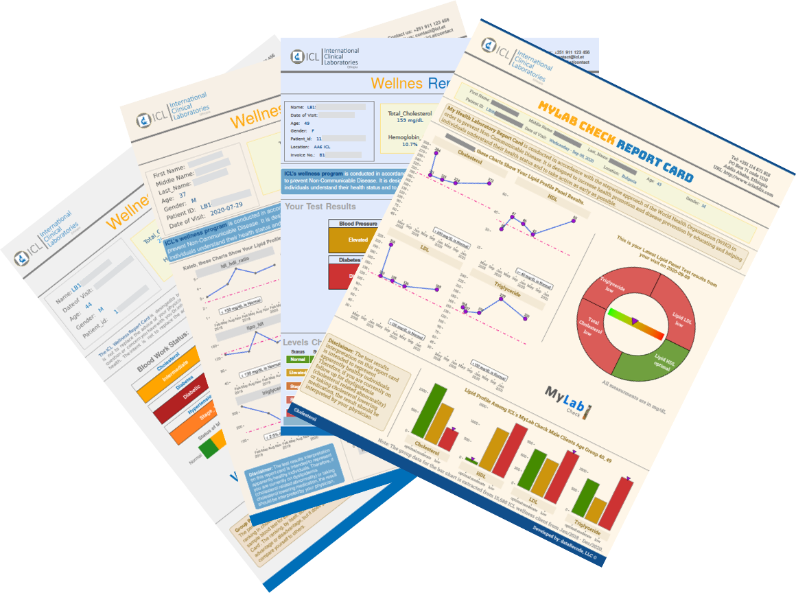 NCD Wellness Report Cards
A customized data-driven system was designed that ingest the raw data and go thru number of steps to clean and prepare the data for analysis. A modular software was developed that runs simultaneously for each of the five non-communicable disease types. Depending on the data input, the appropriate sample generates the label that matches the parameters. The software then generated test results, appropriate visualization tables, and graphics for each patient. Automating the system to scale for several patients on a daily bases was built in the software so that a patient can collect the result in pdf soft copy format, that can also be printed on a daily basis.
On the back, end the system is capable of generating a secondary analysis report for the entire patient population, providing medical expert and management team an overall trends across different disease types. Demographic segmentation and group comparison is also available for further understanding of wellness patients.
Gains from our solution delivery:
- The produced Wellness program are a complementary approach to traditional medicine that offer a number of benefits, including saving medication costs, providing highly customized tracking of health status, and greatly reducing dependency on medication. In some cases, after certain thresholds are reached and with physicians' approval, patients could stop taking medication all together.
- Data-driven report cards provide a visually rich and easy-to-understand display of test results for both patients and physicians. Individual results are aggregated to show overall trends for patient populations across various demographics.
- The non-communicable disease wellness report cards are a repeatable and reproducible process and software that can be expanded or adapted to additional disease reporting with some modification. This is beneficial because it allows for the efficient and effective tracking of disease trends and the development of targeted interventions.
- Because the wellness program is 100% data-driven, ICL’s existing data collection and variable naming convention was reviewed with the IT/Data engineering team and we’ve defined naming convention, raw data extraction and sharing procedures from organization databases db was codified. This was an important step that can be useful for other programs because it ensures that data is collected and stored in a consistent and standardized way. This makes it easier to access and analyze data, which can lead to better decision-making.
- A parametrised reports (one that accept input values that are used when the report is processed) can be generated quarterly, monthly, or annually for the entire patient population and lab test types. This can help enhance understanding of the program and improve processes by identifying trends, areas of improvement, and opportunities for intervention. The process of generating these reports can be automated, which can save time and resources.
- Well-documented and clearly defined data collection procedures, variable naming conventions, and data sharing processes were essential outcomes of our delivery. These processes have a long term high return on investment, and can be adapted to other blood work programs for the organization, that result in more saving, and improving the quality of digital data maintenance and management.
Case Study 2
Industry: Municipality (PublicSector)
Location: Washington, DC (Nort America)
Data profile: Geo Location, GeoSpatial (geoJson map data), NLP (text), Excel, SQL databases
Context:
 The City’s Department of Health (DoH) is mandated to perform food preparation and delivery inspections across the City’s school cafeterias, restaurants and Hotels. The City employ’s hundreds of inspectors who regularly visit the establishments and perform food safety inspections. Upon inspection, where a violation is found, inspectors complete a form where they circle the violation codes, assign a risk score (1 to 5) where the higher the risk score the worst the violation and the urgency of the fix expected from the establishments. Inspectors also write a note describing the violation where a code number may not accurately capture the nature of the violation. These inspections takes place thru out the year and can be random. All the collected ‘data’ is then filed and saved. Over the decades the City has collected millions of records and have them saved in files and databases.
Identified challenges and developed solutions:
The City needed to identify the common factors that impact the food delivery establishments throughout the city ignorer to make policy adjustments. At the same time, the Department of Health wanted to use the historical inspection data to design future training for food delivery business owners and DoH staff. The source for the training was to come from archived data. To harness the valuable lessons and identify trends, it was proposed to build a data driven tool that can be used to identify repeat pattern, identify best practices and forecast inspection staffing needs to meet the season surge loads. For DoH management, It is desired to use the same tool to navigate the historical inspection records in an interactive and intuitive manner.
Data-driven Solution:
The raw inspection data is imported, cleaned and feature engineered to enhance its value usefulness for analyzing and visualization.. A dynamic data inspection dashboard is built with various controls to make the visualization interactive and useful. That controls for the dashboard include the highlight inspections based on violation risk score, by year and by location zip codes. To add to the richness of the dashboard tool, the City’t geompa is used with the exact geolocation of each establishment (in thousands), and upon click a pop-up appears with formatted nots of the inspection, with easy to navigate and drill down capabilities.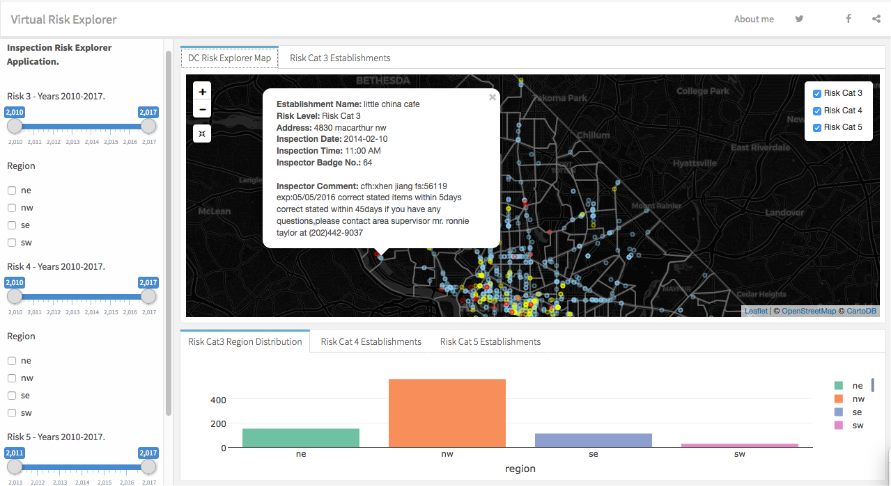
Figure 1: An interactive DC food inspection data driven dashboard
Gains from our solution delivery:
- The data driven application enhances the health inspection exploration by mapping the data points on their geolocation and the relevant information in a Pop-up window, when hovering over the data point. The app can also filter the data based on various criteria.
- The DoH Administrators can use the Dashboard to easily cross check daily inspection reports
- Identify best performing Inspectors and use their work’s best practice or other staff training.
- Can generate report/visualization by area of the city, day-of-the week, type of violation etc
- Better understand the establishment types and trends
- Use the dashboard to measure & plan an increase/decrease inspection staffing
- Use the tool to generate/modify policy for food delivery establishment types.
Case Study 3
Industry: Cennsus (Public Sector)
Location: Washington, DC (North America)
Data profile: csv, Geo Location coordinates, GeoSpatial (geoJSON map data), Excel, SQL databases, pdf tables
Context:
 Census is the process of collecting, compiling, analyzing, evaluating, publishing and disseminating statistical data regarding a population. In the United States decennial census is legally mandated and takes place every 10 years. Census 2020 is the 24th census in U.S. history. Accurate count for Census is important because it helps determine how much federal dollars in funding, grants and support is allocated for states and counties. It helps communities get their fair share of feral dollars for schools, hospitals, roads, and public work projects.
Historically, because certain communities miss from census count, for 2020 Census, administrators wanted to use a data-driven tool to help them identify communities at risk of not getting counted. The objective of the project we worked on is building a data driven tool to improve population count capture rate. The tool is geared to help identify the community at risk of less than accurate count, so that an appropriate outreach strategy is designed and proportional resources allocated to increase count rate.
Identified challenges and developed solutions:
Where and how to start identifying the communities that were not historically counted was one of the biggest challenges for this project. Because past Census databases contain several historical tables, indicators and variables that show where the undercount are located, we wanted to look at the characteristics of the communities where low count rate was prevalent, to help identify low counted communities.
Once we develop the concept on where/how to identify the less represented communities, the next challenge is to build a data-driven web application that can be used to filter the data visually, presenting the characteristics and geolocations on-demand.
Developed data-driven solution:
Brief Version:
We developed a customized interactive data visualization dashboard that allows Census team to track, analyze, and display selected population characteristic variables controlled with various selection options. The dashboard uses curated data in combination with a tract level geolocation map. It includes feature charts, tables, and maps to help users understand the areas of focus in great detail. As a result, the dashboard saves time and increases efficiency by allowing users to quickly and easily access the information they need. It also increases effectiveness by allowing users to more easily focus on the demographics of interest, resulting in better decision-making.
The design and building of interactive dashboard took in to consideration several features in the huge jeojson dataset. Some of the variables we looked at include demographics, education attainment level and whether one or more languages are spoken in a household. We generated several statistical plots by mapping characteristics against low response rate to see if correlation existed, and saw that various levels of strength in relationship were present. Digging deeper in search of strong relationship, we found a more pronounced signal when we looked at the mail response rate to census request forms. It was very fortunate this information was captured as feature in one of the tables, which was very helpful. Those communities that tend to NOT respond (mail back) the survey questions were at high risk of not getting counted. Once we have selected variables and tables to help build the application that can be used to identify undercounted communities, we merge this data with the geographic maps, limiting the granularity to census-track level. The final version of a curated dataset that combines all the mentioned characteristics is generated and used as the resource for the final version of the application.
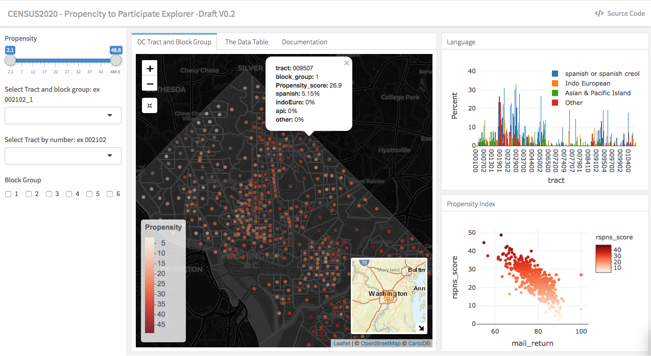
Figure 2: An interactive Census 2020 dashboard
Gains from our solution delivery:
The Census team has an interactive, visually rich tool at its disposal that lets it fly across the country from a single pan of window. Because the data is pre-processed and features in the data are focused on addressing the less counted communities, users have a focused less noisy information at their disposal helping them make more precise choices for resource allocation and select appropriate campaign that has most impact depending on the selected community. Efficient use of time and effective resource allocation is gained because of the data-driven tool we created.
Contacts:
sales: sales@datarecode.com
Technical support: support@datarecode.com
Information: info@datarecode.com
Copyright © 2016 dataRecode.com, LLC. All rights reserved.
 dataRecode